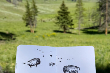
Do you ever dream about watercolors? I do! And I had a dream about a new Art Toolkit Folio palette configuration and had to try it! :)
Say hello to my new setup for World Watercolor Month — on the left!

I had been using this as a mixing palette, and decided to convert it for July. By the way, if you haven’t heard about World Watercolor Month, it’s a challenge from Charlie O’ Shields to watercolor each day in July and raise money for art education. Last year I focused on painting trees, but this year I just wanted to have fun and play. Find out more about WWM here.
I’m still using my trusty old Folio too. I’ve had it set up this way for about a year now with some minor tweaks, and I love it! The larger pans are great for big brushes. It has 17 colors, which is a lot for me. I’ve used it so long it’s like second nature — I don’t have to think about where everything is or what I’m going to mix.
But for World Water Month I decided to dig out all the tubes of color that I have stuffed in a drawer and play! Some of these are really old — we’re talking 10-15 years old! But they’re still going strong. These colors are all kinda random and that’s totally unlike me lol!
Here it is in action — I made a fun little popsicle card for my nephew and turned it into a tutorial:
Here are the 28 (!) colors in the new setup clockwise from upper left:
DS = Daniel Smith, WN = Winsor & Newton, S = Schmincke, H = Holbein
- Top row: DS Hansa yellow light, WN Winsor yellow (PY154), DS New Gamboge, WN Yellow ochre, DS Quinacridone gold, S transparent orange, DS organic vermillion, DS pyrrol red (PR254), DS quinacridone rose, DS permanent alizarin crimson
- Right side: DS deep scarlet, DS piemontite genuine, DS lunar earth, DS transparent red oxide, DS Van Dyck brown
- Bottom row: WN indigo, DS indigo (they’re so different!), H ultramarine blue light, DS phthalo blue red shade, DS cobalt blue, DS cerulean, DS phthalo blue green shade, DV colbalt turquoise, DS cascade green
- Left side: DS carbazole violet (PV23), WN smalt, DV lavender, DS Chinese white
Here are the colors in my original Folio, just in case you were wondering:
- Top row: DS Hansa yellow light, DS Hansa yellow medium , WN Cadmium yellow pale, DS quinacridone gold, DS raw sienna, DS transparent red oxide, DS phthalo green (blue shade)
- Middle row: DS phthalo blue (green shade), DS phthalo blue (red shade), WN cobalt turquoise, H cerulean blue, DS cobalt blue, WN French ultramarine blue
- Bottom row: WN permanent rose, DS quinacridone coral, DS organic vermillion, WN Indian red, DS indanthrone blue
Labeling Your ATK Pans
I’ve been asked a few times about how I keep track of my pans, and here’s what I came up with: Avery labels in size 5414! For the mini ATK pans I just cut them in half.

I used to write on the bottoms of the pan with a sharpie, but somehow it always came off. Labels to the rescue! I still write on them with a sharpie or a waterproof pen.
I keep the labeled pans in a butcher tray/mixing palette that I don’t use much anymore. If you’d like to get fancy, try a magnetic sheet and pocket system meant for craft die storage.
Links
If you’d like to set up a Folio palette like this, you’ll need:
- 2 XL mixing pans
- 28 mini pans
- and a Folio palette
Art Toolkit gave me a code to share with you — use code LISAFAN10 for 10% off your purchase! :)
Happy painting!
8 Comments
Mary · July 3, 2022 at 7:09 pm
Hi, Lisa, love the new palette set-up! It’s a miniature of the large white “studio” palettes which fold in half. I’m wondering how using only mini pans is working for your brushes since you are used to some larger pans. Also, you listed DS Indigo 2x in the bottom row. Is that a mistake – in other words, should a different color be listed instead of the 2md Indigo?
I really love the look of this!
Lisa Spangler · July 3, 2022 at 7:46 pm
Hi Mary! I have two indigos in there — one is Daniel Smith (DS) and the other is Winsor & Newton (WN). I used to use WN indigo years ago and I had some left in a tube so thought I’d compare it to the DS version which is based on one of my favorite colors of all time — indanthrone blue!
It does seem like one of those palettes that you fold in half — or one of the big porcelain ones! I’m enjoying using it now but I suspect that once World Watercolor Month is over I’ll probably going back to my original layout — this is just for fun and trying to use up some of the colors I had stashed away in a drawer! :)
Lisa Spangler · July 3, 2022 at 9:02 pm
Hi again, Mary! I see what you mean now — fixed! Thank you! :)
Bob Cochran · July 3, 2022 at 7:12 pm
Hi Lisa, thank you for posting this. I’ve learned some new things from you as always: World Watercolor Month, creating popsicle cards, the paints you are using, and labels. Using labels is a really cool idea.
I have a question about your pan arrangement. Suppose you want to lift a specific pan out of the palette. How do you do that? Especially in the field. And the labels: are they difficult to remove from the bottom of the pans?
I am sure your nephew was overjoyed to have a popsicle card from you, and I hope his parents keep the card safe and hand it to him when he is ready for that.
Lisa Spangler · July 3, 2022 at 7:50 pm
Hi Bob! I use a pair of tweezers to lift pans out — I don’t generally remove them in the field, just wait until I get home. I’ve also used a palette knife to lift them up (carefully). The labels have been easy to remove so far — they just peel off. Hope my nephew likes the card — I mailed it to him! :)
Bob Cochran · July 3, 2022 at 7:58 pm
I like your popsicle card, Lisa. It is a real winner. I just realized I too can paint a card for the little boy who lives at the other end of my townhouse row. He just turned age 1.
Bob Cochran · July 4, 2022 at 10:46 am
This post inspired me to make a similar popsicle card for a very young neighbor. I’m going to do something for each of the other children in the neighborhood too. I’ve learned a lot from this. It gives me experience with the Greenleaf & Blueberry “Modern Primary Trio” paints, Arches paper, and a new Rosemary & Co brush. I have so much to learn.
Mary · July 4, 2022 at 10:57 am
Good for you, Bob!