Hey, friends! So I updated my palette — hoping this is the last one for a while because we’re going to be traveling full time in our converted camper van and it will be hard to get paint on the road. We like to go to remote places, and sometimes we have a hard time just getting to a grocery store, much less getting art supplies. I went back and forth on this for days — no, make that weeks! So this is kinda scary!
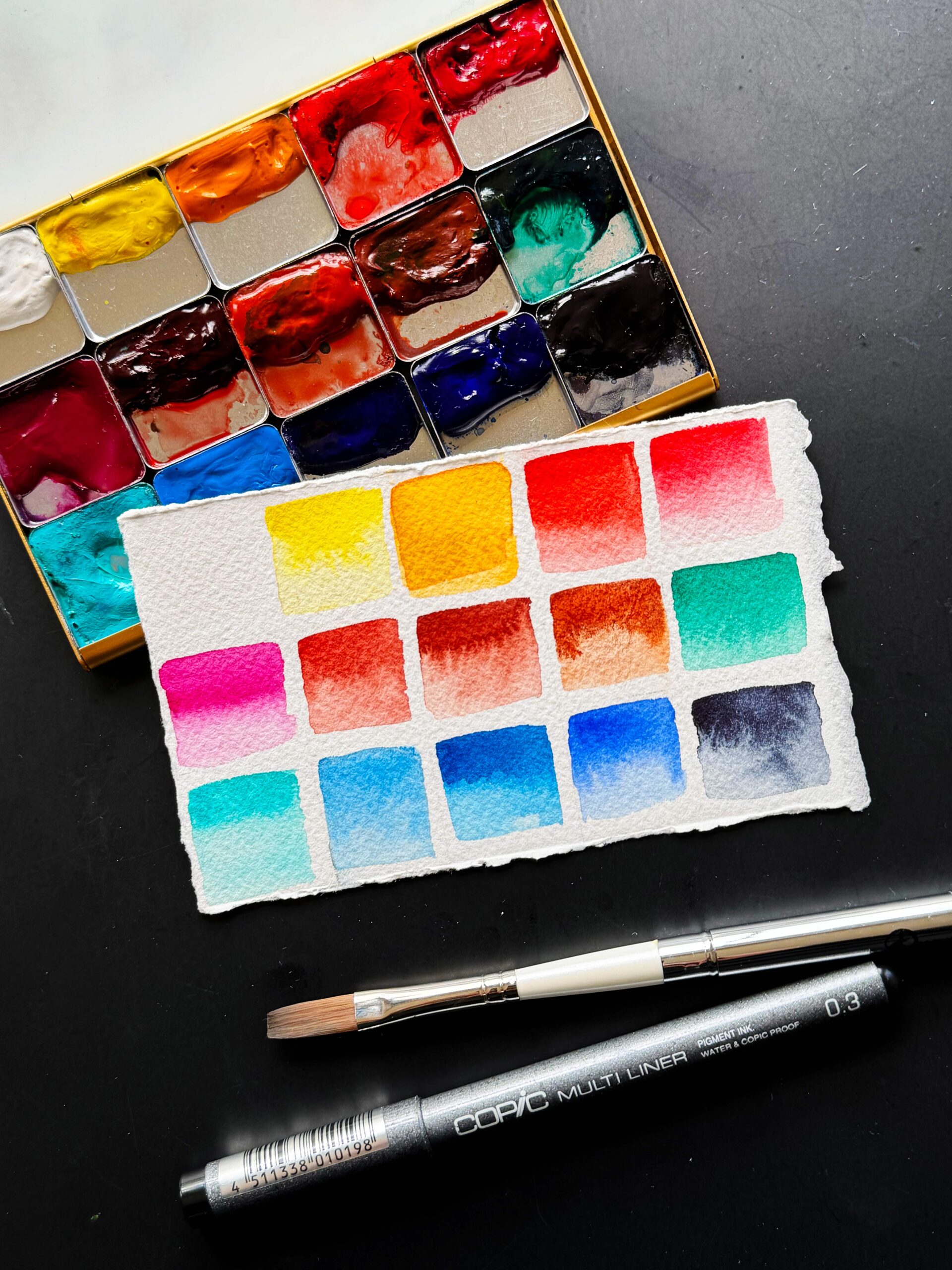
Here’s what I settled on — all colors are Daniel Smith unless specified. WN = Winsor & Newton, H = Holbein. Note: I intentionally only fill my pans halfway so I have room to work the color around/activate it.
Top row: Chinese white (PW4), azo yellow (PY151), permanent yellow deep (PY110), organic vermilion (PR188), quinacridone coral (PR209)
Second row: quinacridone magenta (WN, PR122), quinacridone burnt scarlet (PR206), Venetian red (PR101), transparent red oxide (PR101), pthalo green (blue shade) (PG7)
Third row: cobalt turquoise light (WN, PG50), cerulean blue (H, PB35), phthalo blue, green shade (WN, PB15), ultramarine blue light (H, PB29), indigo (PB60 + PBk6)
These Got the Boot
And for those who have been following along, I removed cobalt blue, quinacridone gold and both raw sienna and yellow ochre — I usually had one or the other of these two! I’m bringing along some tubes and prefilled pans of these though, just in case. Here’s my reasoning:
- Cobalt blue – I mainly used this for skies as it’s a shy mixer, and it’s also hard to rewet. I can get pretty close to it by mixing ultramarine + either cerulean blue or cobalt turquoise light.
- Quinacridone gold – I can mix a similar color with azo yellow + transparent red oxide, so it was just taking up a spot. I’ve noticed that it kind of fades on me too, so I’m suspecting it’s not as lightfast as it’s claimed to be.
- Yellow ochre/raw sienna — I’ve also noticed that my raw sienna has been fading over time, plus I can never decide between these two! I can mix them pretty easily.
Phthalo Green?! Gasp!
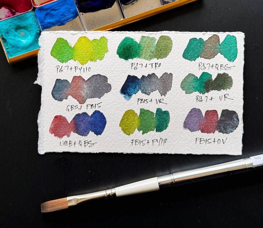
This was a nerve wracking addition, but the more I use it the more I love it! Here’s my logic: I was out of Daniel Smith sap green, so I looked it up to see what pigments were in it. It’s PY110 + PG7. So I was like hmmmm, PY110 (permanent yellow deep) looks like a great color to have instead of new gamboge, which I’m not all that fond of. Then I started mixing phthalo green with everything else on my palette and it turns out it’s amazing to have!
It even makes an awesome purple with quin magenta!
Why do you have 3 rusty brown colors?
This is something I’m a little nervous about, but I’ve wanted to have all 3 in my palette for years so I decided to go for it!
- quinacridone burnt scarlet – I’m in love with this color! I use it so much for botanicals. Mixed with magenta it makes a great subsitute for alizarin crimson — I could never get behind that color! It’s transparent but somehow adds granulation to the phthalos. It’s like magic.
- Venetian red – this is a REALLY opaque color. It gives mixes a velvety, suede texture. It’s great for rocks, and it mixes with cobalt turquoise light to make the perfect desert green, for yuccas, cacti and their allies.
- transparent red oxide – I’ve had this on my palette for years and can’t live without it.
And there you have it! I have a few more posts planned about why I chose these colors in the works, so stay tuned!
PS. Use code LISAFAN10 for 10% off your purchase of an ArtToolkit, palette, or mixing pans.

2 Comments
Katie K · June 29, 2024 at 1:49 pm
Enjoyed reading your thoughts on your color choices, and they have me intrigued. I so relate to your comment about alizarin crimson, I’ve got a huge tube and made so many mixing charts, and find very little use for it! Seth’s to go muddy even with colors it shouldn’t.
It will be fun to see if you are happy with the choices, they seem to be great to me, sand I look first to setting what you create!
Quinn · July 1, 2024 at 5:19 am
Is there any reason you picked Chinese white over Titanium? And would these colors work for landscape plein air in Utah? I have been enjoying organic vermillion; thanks for that tip! And thanks for sharing your inspiring journey!