What do I mean by desert green? Feast your eyes on the cacti and agaves below to see:
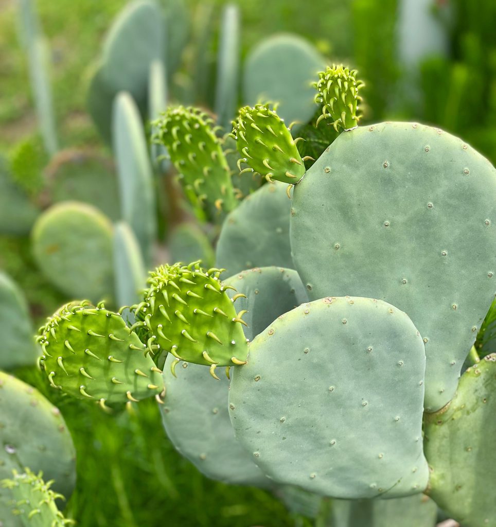
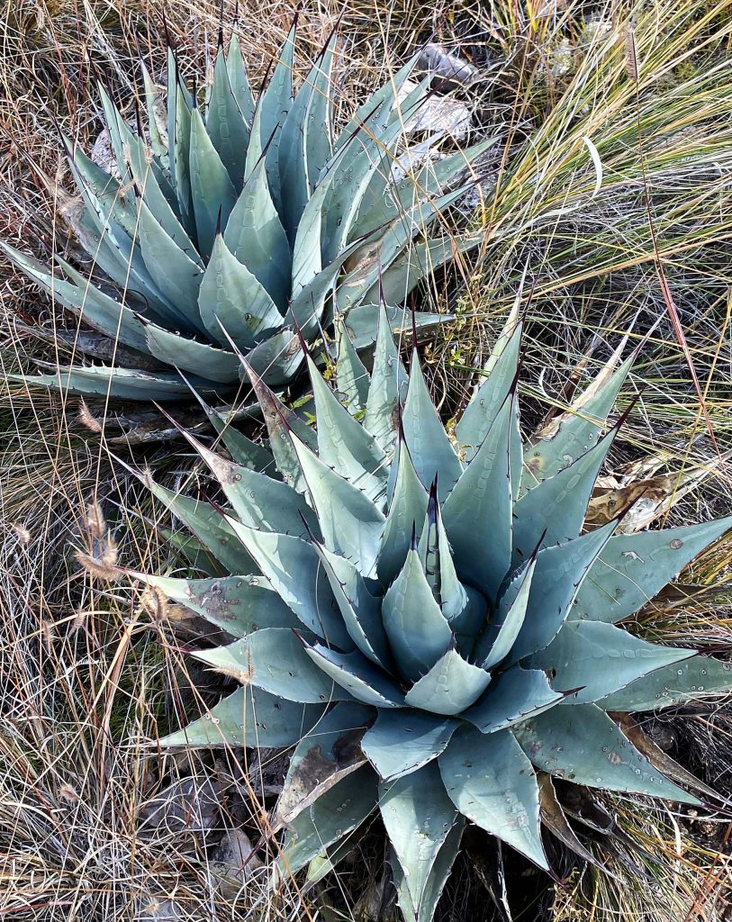
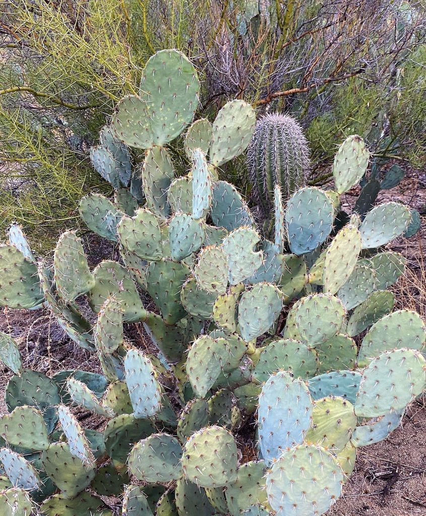
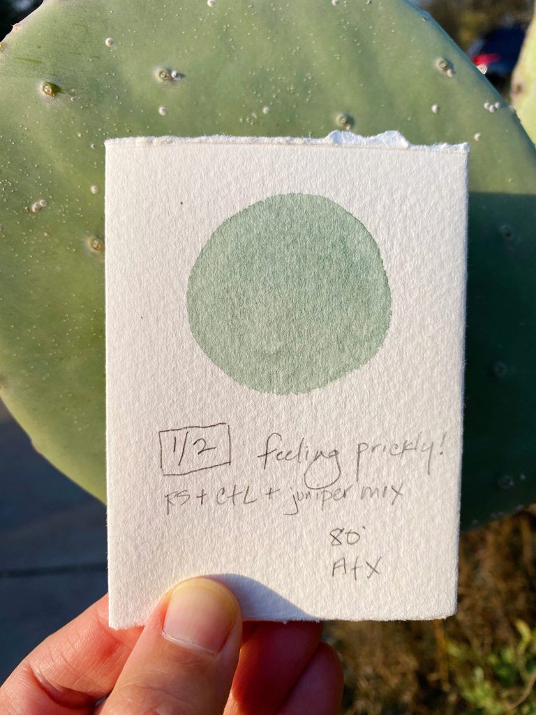
Did you spot the baby saguaro? :)
This opaque dusty green really used to trip me up when I first got started with watercolors. But not anymore!

I found some key colors that really make mixing this elusive color so much easier:
- PR233: Potter’s Pink — one of the keys to neutralizing greens is adding a little of its red mixing complement, and potter’s pink does just that when mixed with the greens below. I’ve found the Daniel Smith version dries as hard as a rock in my palette so I love the Letter Sparrow version because it’s easy to rewet. I’d like to try the Winsor & Newton version someday.
- PG17: Chromium green oxide / Letter Sparrow pistachio — this granulating, opaque color is perfect on its own or in mixes. Add a little yellow for a more vibrant green, or mix it with potter’s pink for that dusty desert look.
- PG50: Cobalt green / Letter Sparrow Kelly green — can be used on its own or mix this color with chromium green oxide above or with potter’s pink for a grayish green
- Letter Sparrow peacock — this is a mix of phthalo blue (PG15) + phthalo green (PG7) and is way too vibrant by itself — but mixed with potter’s pink it’s perfect!
- PG50 Cobalt turquoise blue / Letter Sparrow turquoise (PB28) is another one that’s great mixed with potter’s pink. It’s also really nice with Letter Sparrow violet ochre (PR101) or DS Venetian red (also PR101). Check out this post on Cobalt Turquoise light/PG50 for more info on this color — it’s one of my favorite paints and I put it on just about every palette.
Mixing in indanthrone blue, a violet, neutral tint or indigo will get you get you the darker toned greens.

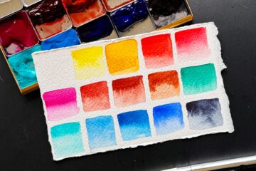
It’s worth it to try the colors on different papers because the granulation will settle out differently. Here the top paper is Arches cold press and the bottom two are Canson Montval.
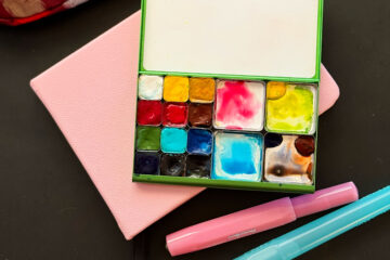
One last tip: I use the extra large mixing pan space for all my desert greens — and I never bother to clean it out!
Happy mixing! Let me know if you have any questions and I’m happy to answer — Lisa
2 Comments
KimberLee · May 11, 2023 at 5:26 pm
I definitely see some new color purchases. I just love how many different combinations you have created with just a few key colors. They really do capture the dessert colors. Thanks for sharing your knowledge and creations.
Lisa Spangler · May 11, 2023 at 7:41 pm
Thanks so much, KimberLee! Happy painting! :)